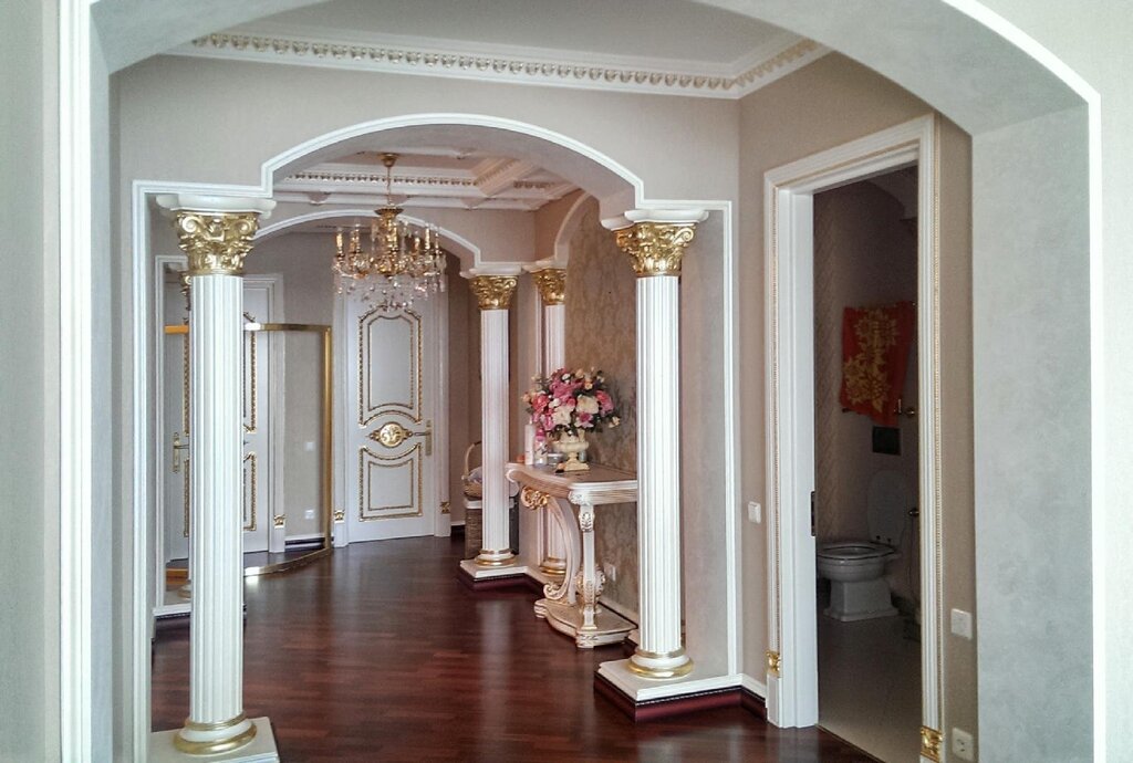
Color scheme for the hall 18 photos
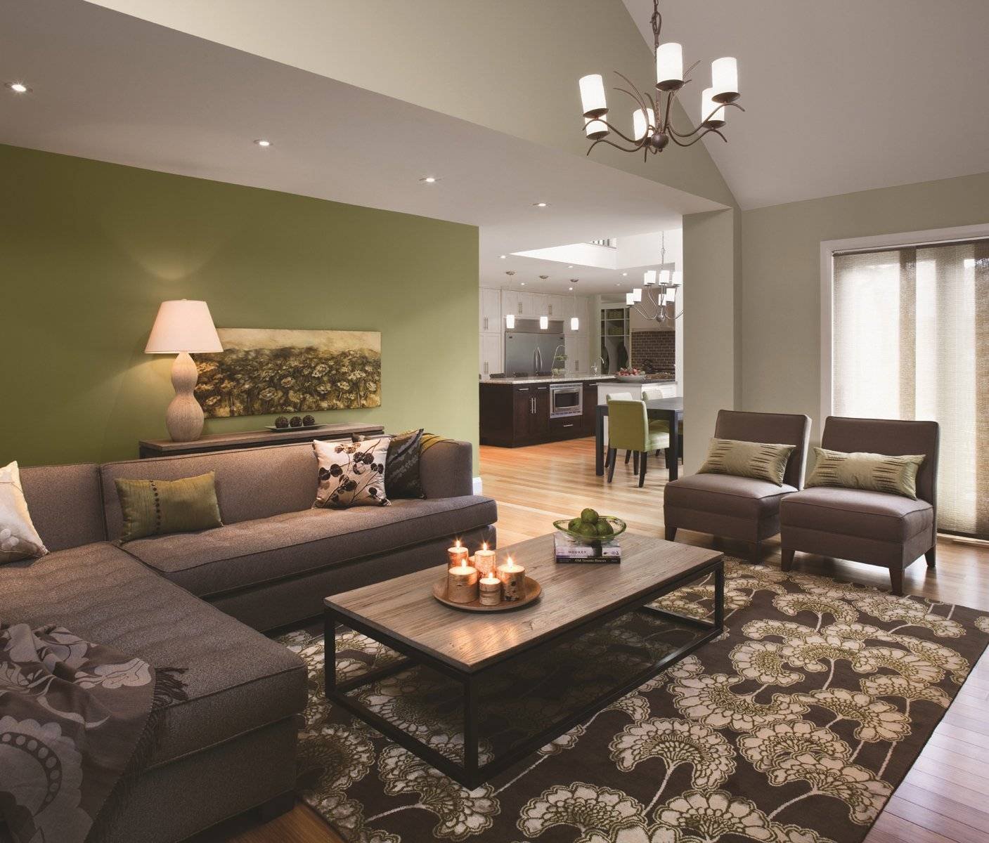
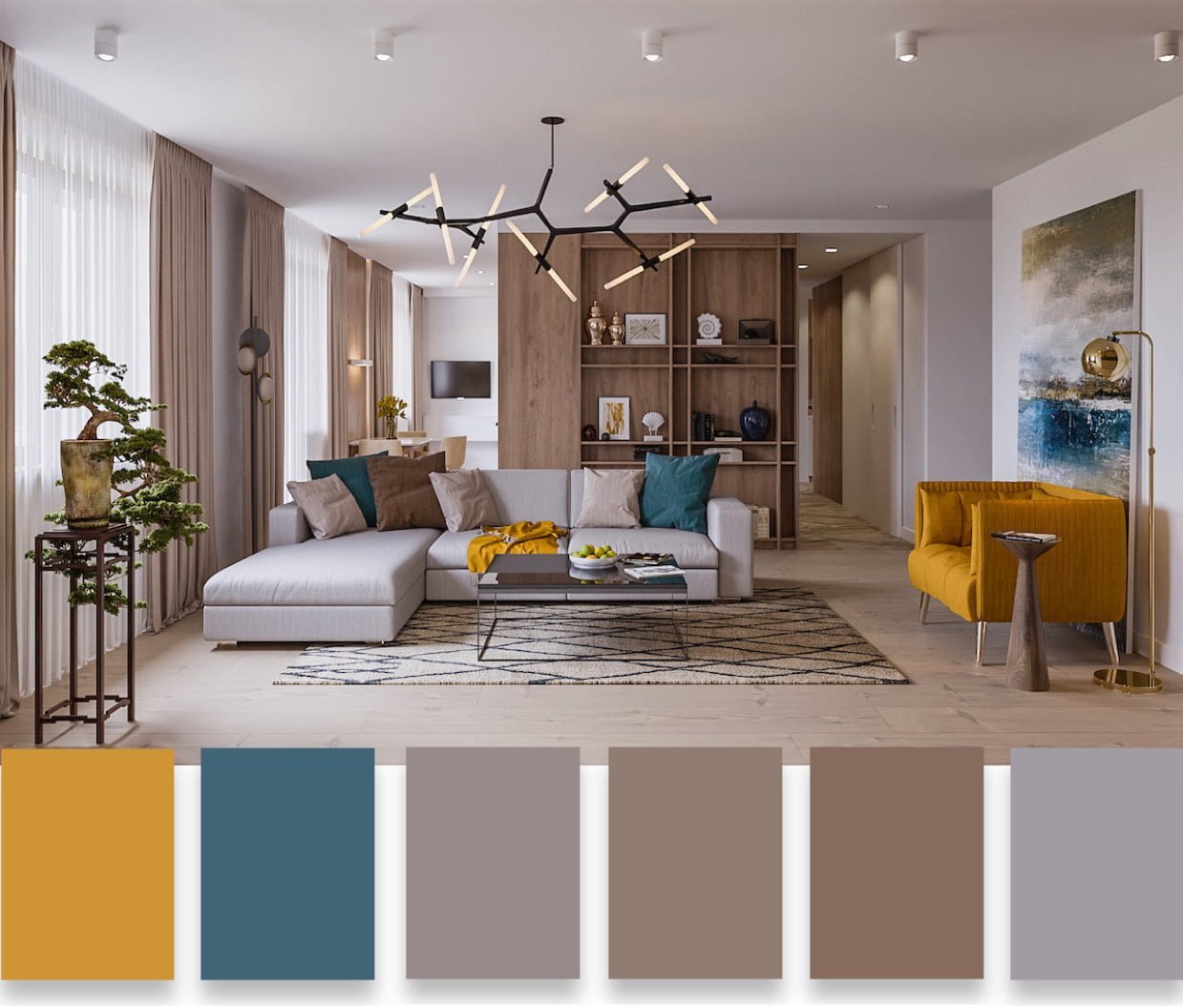
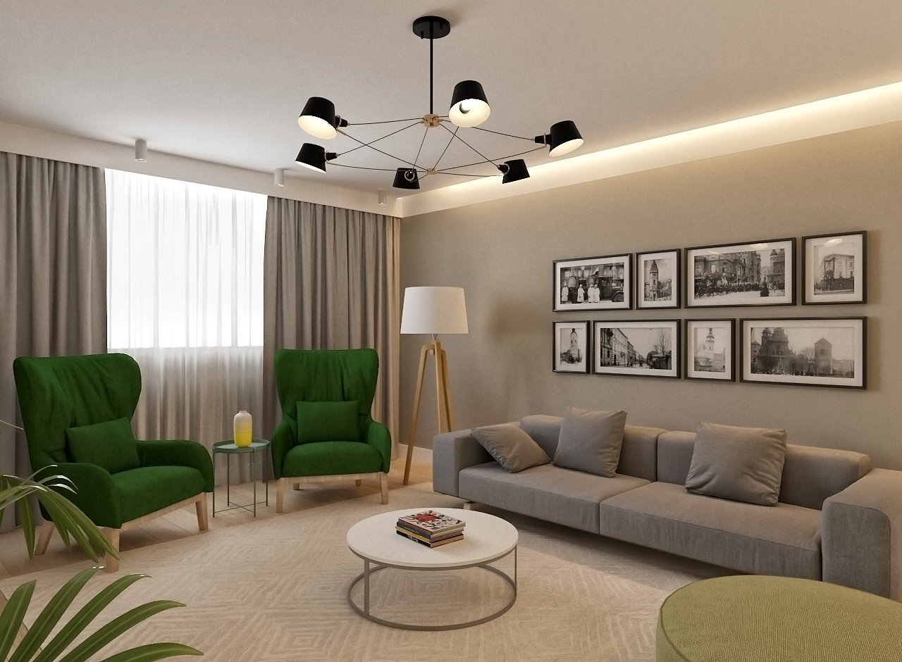
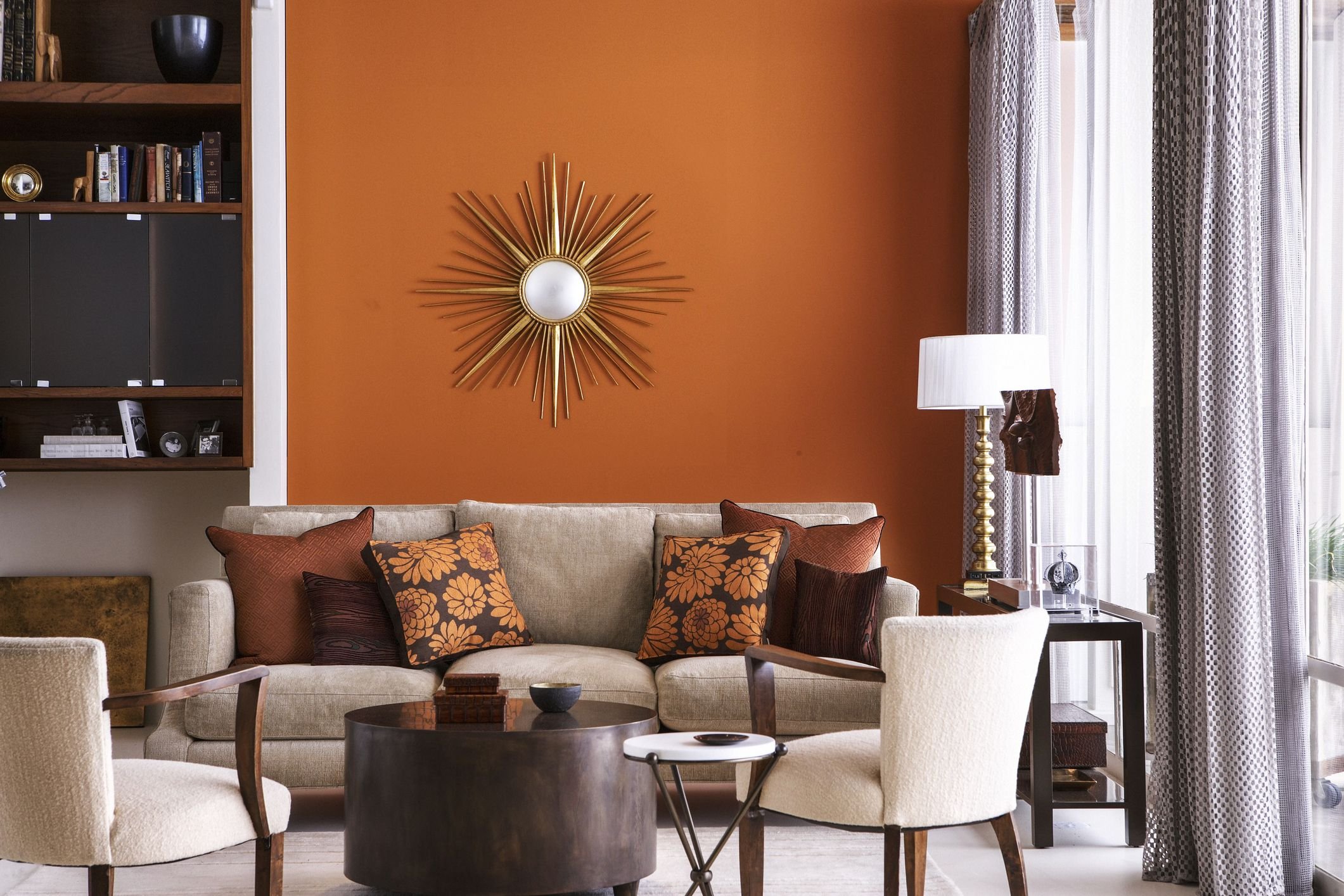
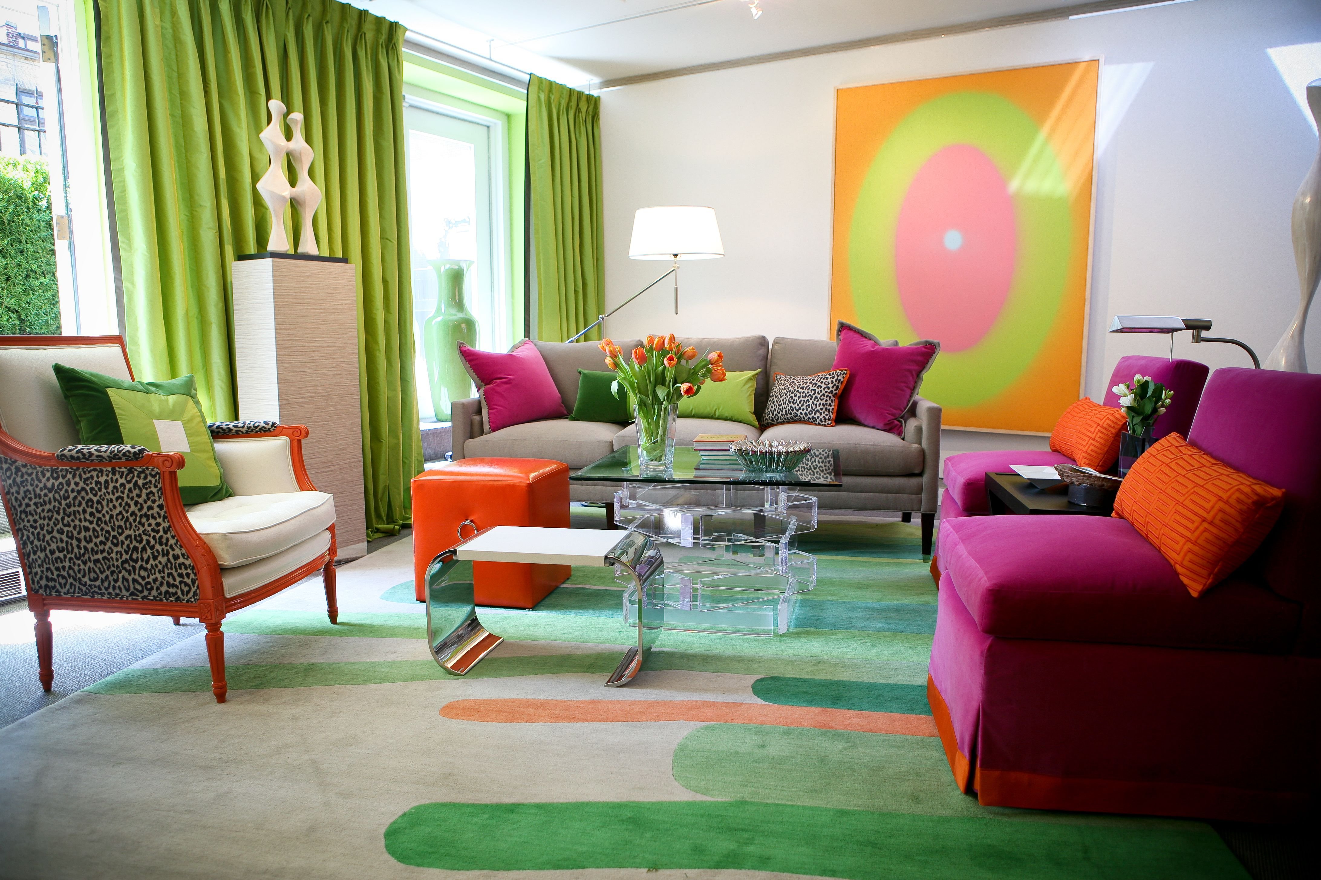
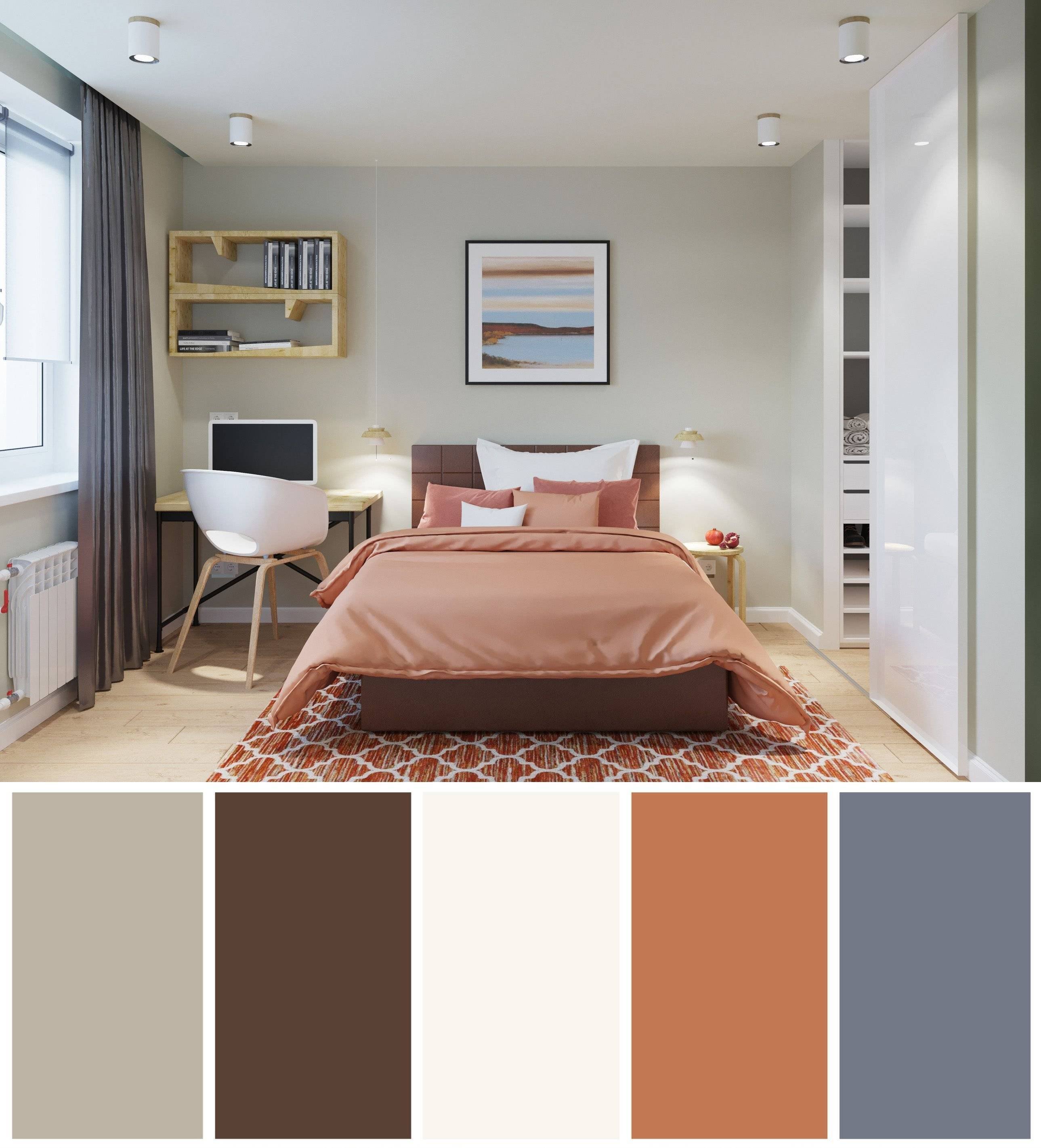
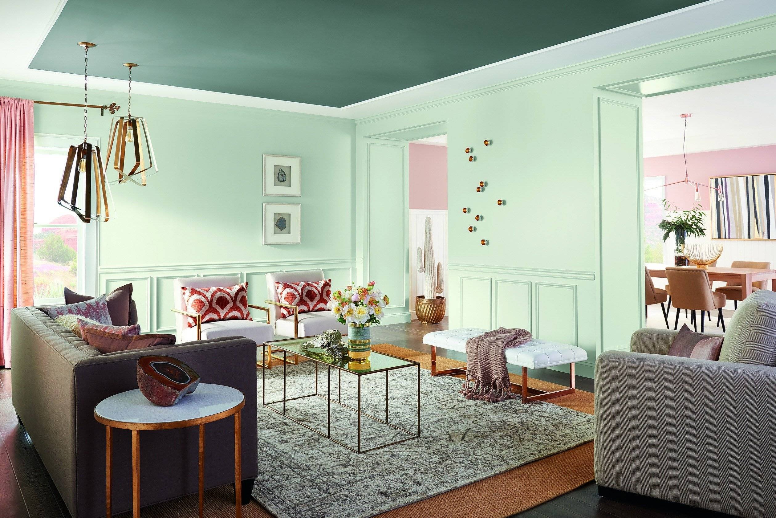
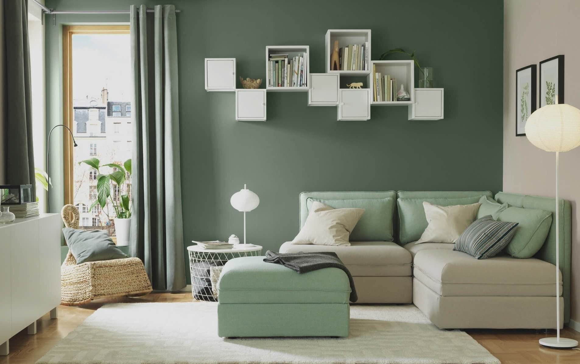
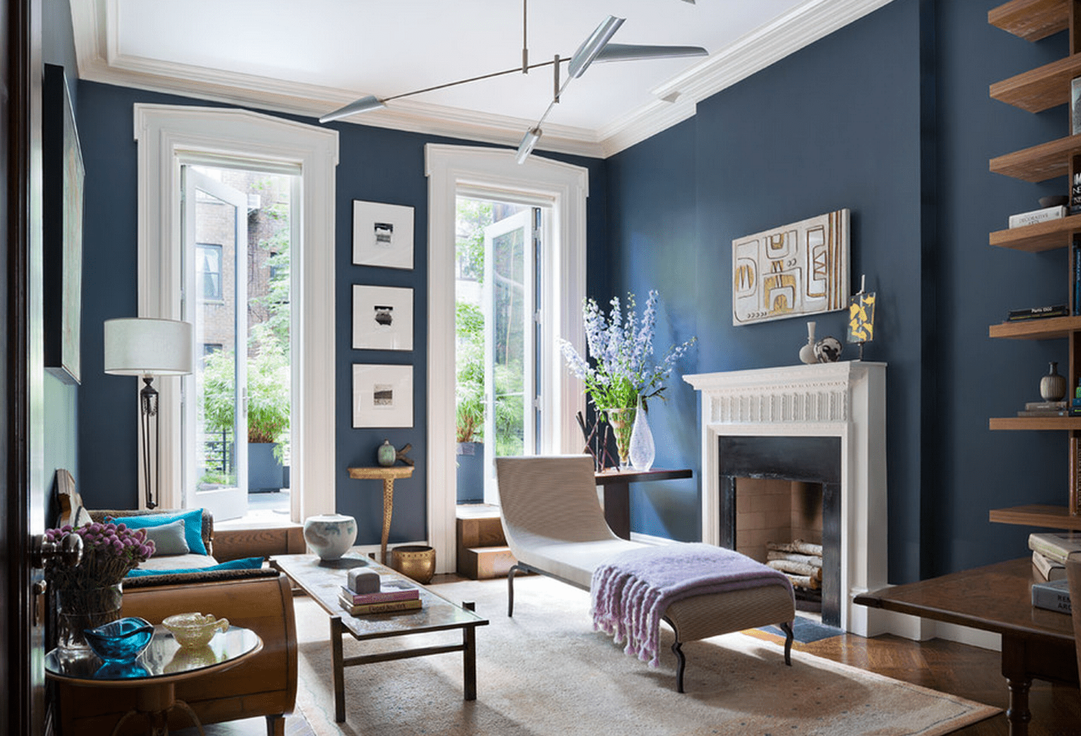
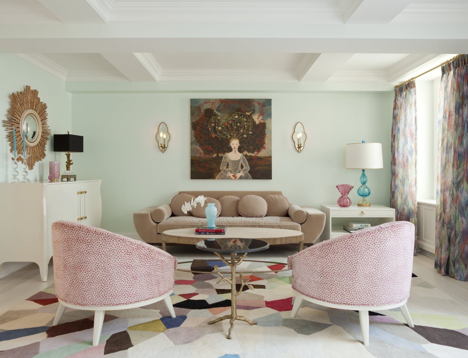
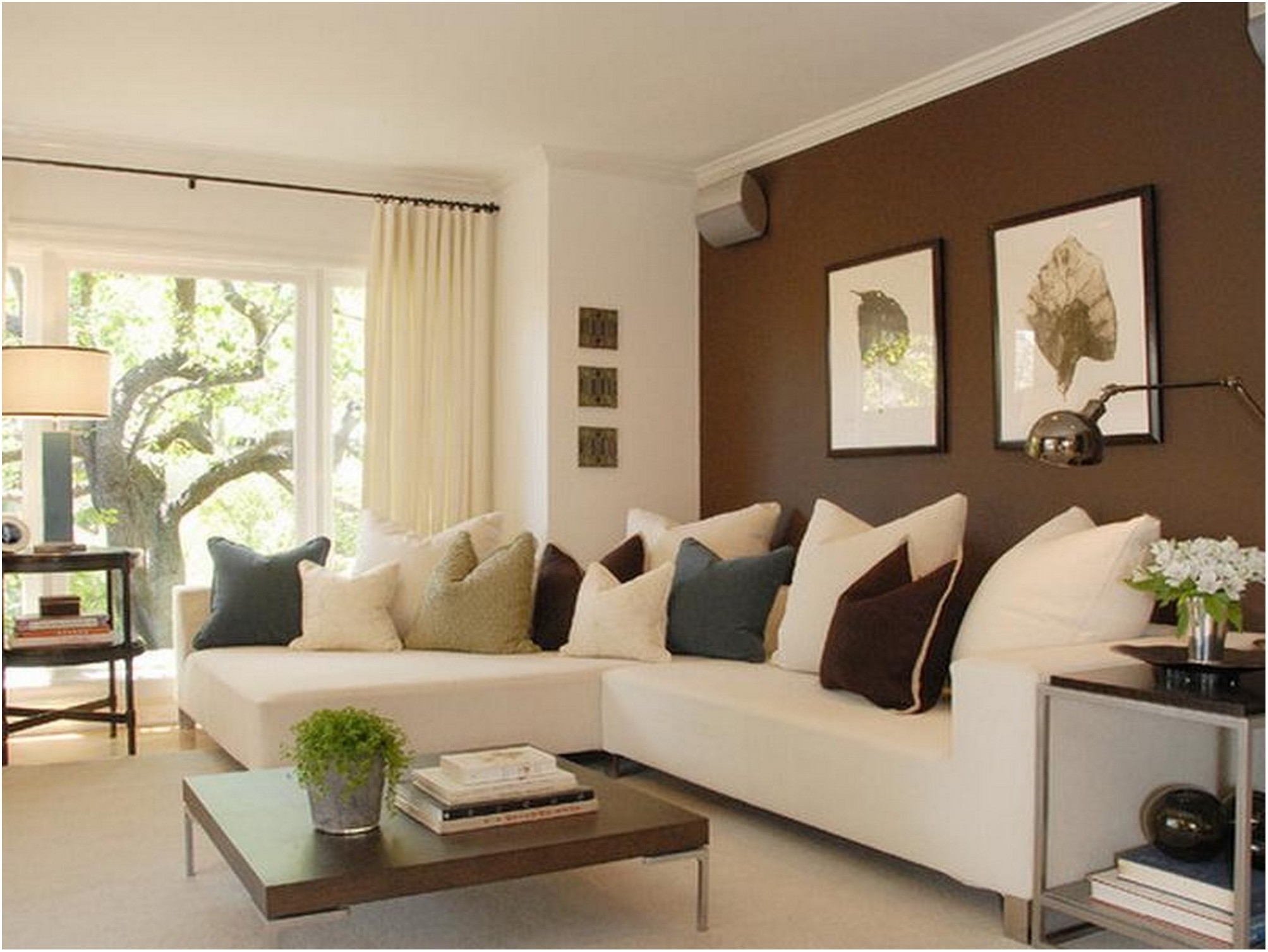
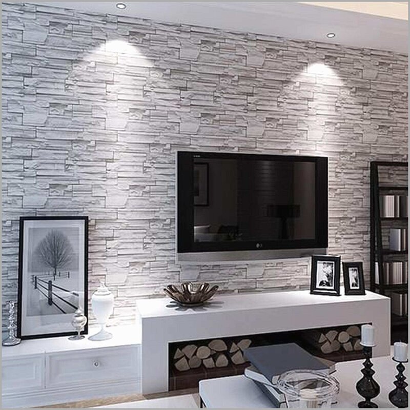
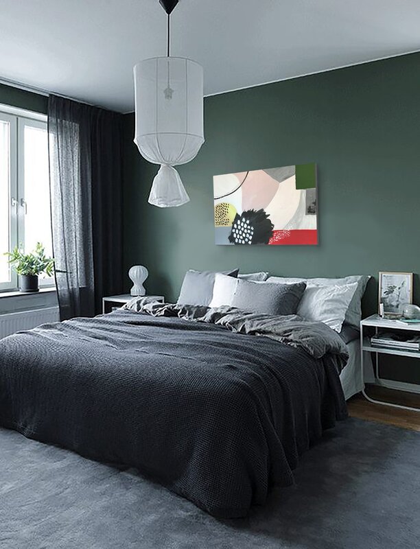
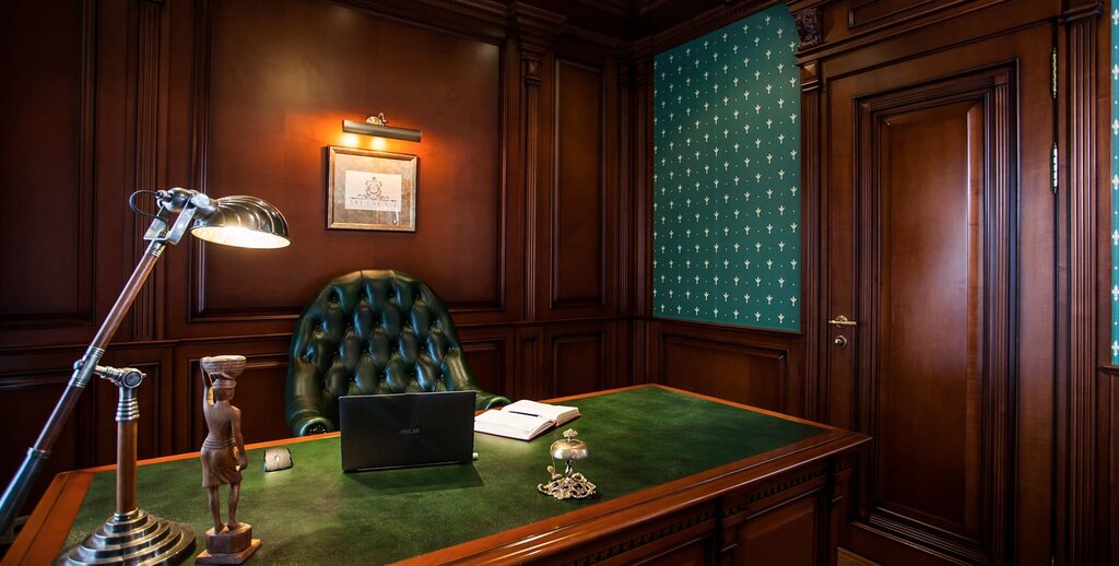
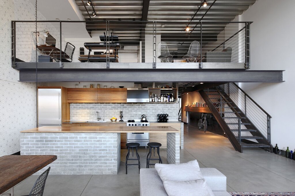
Creating a harmonious color scheme for the hall is an art that blends aesthetics with functionality, transforming this pivotal space into a welcoming gateway for the rest of your home. The hall, often the first impression for guests, benefits from careful consideration of colors that reflect both personal style and spatial dynamics. Neutral tones like soft grays, creams, and beiges create an inviting canvas, offering versatility and timelessness. These shades can make the space appear larger and more open, while still allowing for the incorporation of accent colors through accessories or artwork. For a more dramatic entrance, rich hues such as deep blues or elegant greens can add depth and character, making a bold statement. Consider the natural light available; lighter colors tend to brighten up spaces with limited sunlight, while darker shades may bring warmth to overly bright areas. The floor and ceiling colors also play a critical role in the overall harmony, so balance is key. Ultimately, the color scheme should resonate with the rest of the home’s design, ensuring a seamless transition from the hall to adjacent rooms. Thoughtful color choices not only enhance aesthetics but also influence mood, making your hall a true reflection of your home’s essence.
